
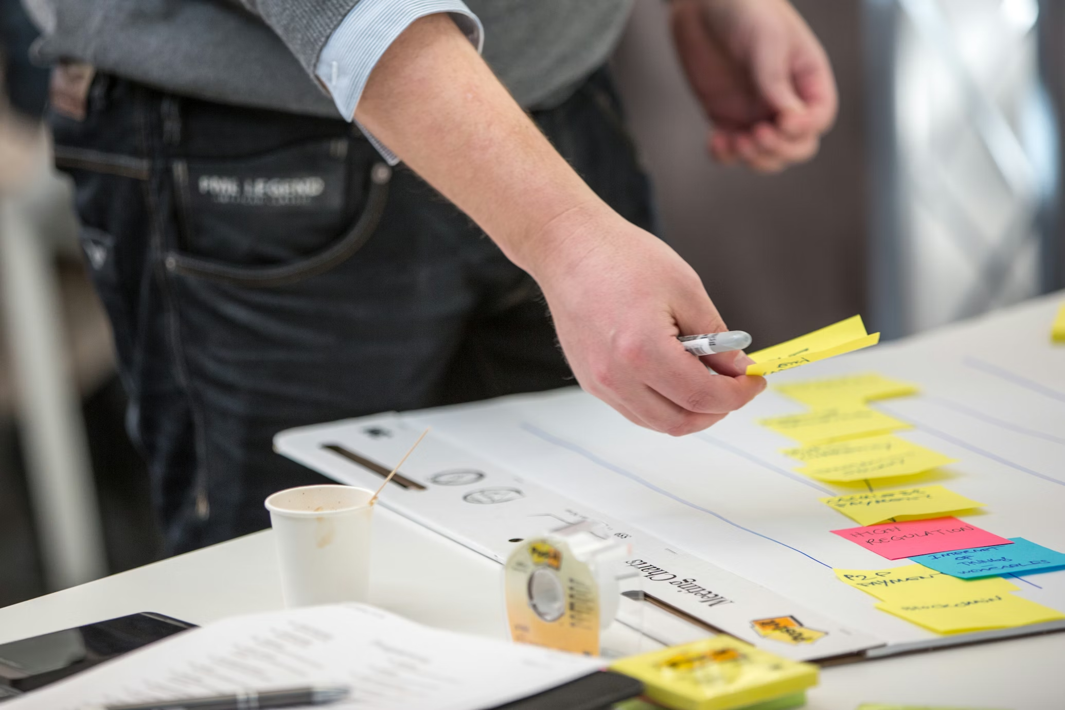
Website design keeps changing because the way people use the internet keeps changing. Pages are skimmed, not studied. Decisions are made quickly. If something feels confusing, slow, or visually overwhelming, people leave without thinking about it.
That shift has pushed design in a more grounded direction. Instead of trying to impress users right away, modern website design focuses on making visitors feel comfortable as soon as they land. This focus on clarity and predictability can be seen clearly in modern website design in Hollywood, where user experience takes priority over visual excess
Small Interactions That Feel Natural
A few years ago, large animations were everywhere. They looked impressive but often distracted from what the page was trying to say. Many of them slowed things down and made simple actions feel heavier than they needed to be.
Now, design relies on small, functional interactions. Buttons respond when hovered. Forms confirm actions instantly. Content appears smoothly as users scroll instead of jumping into place.
These details do not demand attention. They simply reassure users that the site is responding to them. When interactions behave the way people expect, the experience feels calm and intuitive. Nothing has to be explained, which is exactly the point.
Layouts Built for How People Actually Read
Most people do not read a webpage from top to bottom. They scan first, looking for cues that tell them whether the page is relevant to them.
That behavior is shaping modern layouts. Content is broken into clear sections. Headings are descriptive instead of decorative. Paragraphs are shorter and more focused.
Spacing plays a bigger role than it used to. When a page feels crowded, users tend to leave. When there is room to breathe, the content feels easier to approach. Long pages stop feeling overwhelming when the structure is clear and predictable.
Design That Shows Personality Without Trying Too Hard
Many websites today look clean and polished. The problem is that a lot of them look the same.
Designers are starting to pull back from overly perfect layouts and lean into choices that feel more personal. That might mean custom illustrations, slightly asymmetrical sections, or visual elements that do not feel factory-made.
This does not mean sacrificing professionalism. It means letting the brand feel present. When a website feels like it has a point of view, it becomes easier to connect with and easier to remember.
Typography Doing More Than Filling Space
Typography has become one of the most important design tools. Instead of acting as decoration, text now carries structure and hierarchy.
- Headings guide users through the page.
- Font weight creates emphasis where it matters.
- Line spacing improves comfort, especially on smaller screens.
Rather than stacking multiple fonts, designers are choosing one or two and using them consistently. When typography is strong, the rest of the design can stay simple. The page feels more focused and easier to read without adding visual noise.
Bringing Back Depth in a Subtle Way
Flat design removed many visual cues that helped users understand what they could interact with. As a result, some websites felt unclear.
Design is slowly bringing depth back, but with restraint. Soft shadows, layered cards, and subtle contrast help separate elements from each other.
This makes pages easier to understand at a glance. Buttons look clickable again. Sections feel organized. The result is clarity, not decoration.
Personalization That Supports the Experience
Personalization used to mean aggressive tactics. Popups, forced recommendations, and constant prompts often did more harm than good.
The newer approach is quieter. Content adjusts based on context rather than identity. Messaging feels relevant without announcing itself.
When personalization works this way, it reduces friction. Users find what they need faster without feeling interrupted. The experience feels thoughtful instead of intrusive.
Accessibility Influencing Better Design Decisions
Accessibility is no longer being treated as a checklist item. It is influencing design decisions from the beginning.
Clear navigation, readable text, and strong contrast make sites easier to use for everyone. These choices improve comfort and reduce cognitive load.
When accessibility is built into the design process, the site feels more intentional. It becomes easier to navigate, easier to read, and ranks higher.
Performance-Shaping Visual Choices
Speed has become a design consideration, not just a technical one.
Users notice load times immediately. A slow site feels unreliable, no matter how good it looks. That reality has changed how designers approach visuals. Images are optimized. Heavy effects are used sparingly. Layouts avoid unnecessary complexity. Fast sites feel smoother and more dependable, which encourages users to stay longer.
Letting Content Lead the Design
Designs built around placeholder content often struggle once real copy is added.
More teams are starting with actual content early in the process. Layouts are shaped around real messages instead of forcing text into pre-built sections. This approach makes websites more flexible and easier to maintain. As content grows or changes, the design adapts without breaking.
Choosing Trends With Intention
Not every trend is going to fit every website. Some ideas work well in one context and feel distracting in another. Trends work best when they support clarity and usability. They stop being useful when they exist only to look current. Strong websites choose trends carefully and let them serve a purpose instead of leading the design.
Final Thoughts
Website design trends reflect how people behave online right now. They are signals, not instructions.
The most effective websites focus on clarity, speed, and comfort. They make things easy without calling attention to the design itself.